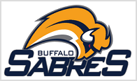
New Buffalo Logo/Jersey Unveiled
 It's official -- the Buffalo Sabres now have the worst logo in the National Hockey League. Dubbed the "Buffaslug" by various bloggers and Sabres' fans, this is just plain terrible. The only saving grace this thing has is that it brings back the team's original colors. Other than that . . . . ick!! The jerseys look terrible with that . . . thing crawling across the chest.  However, I do like that they've added the player's number to the front of the jersey. An interesting touch that I really like. Had they reverted to the original design, with or without adding the number to the front, I think everyone would have been happy. For more on the history of the Sabres logo change, click here. For more on ugly logos, stop by James Mirtle as he lists the 15 worst hockey logos. However, I do like that they've added the player's number to the front of the jersey. An interesting touch that I really like. Had they reverted to the original design, with or without adding the number to the front, I think everyone would have been happy. For more on the history of the Sabres logo change, click here. For more on ugly logos, stop by James Mirtle as he lists the 15 worst hockey logos. |


Comments on "New Buffalo Logo/Jersey Unveiled"
post a comment